Moneyfarm Illustration
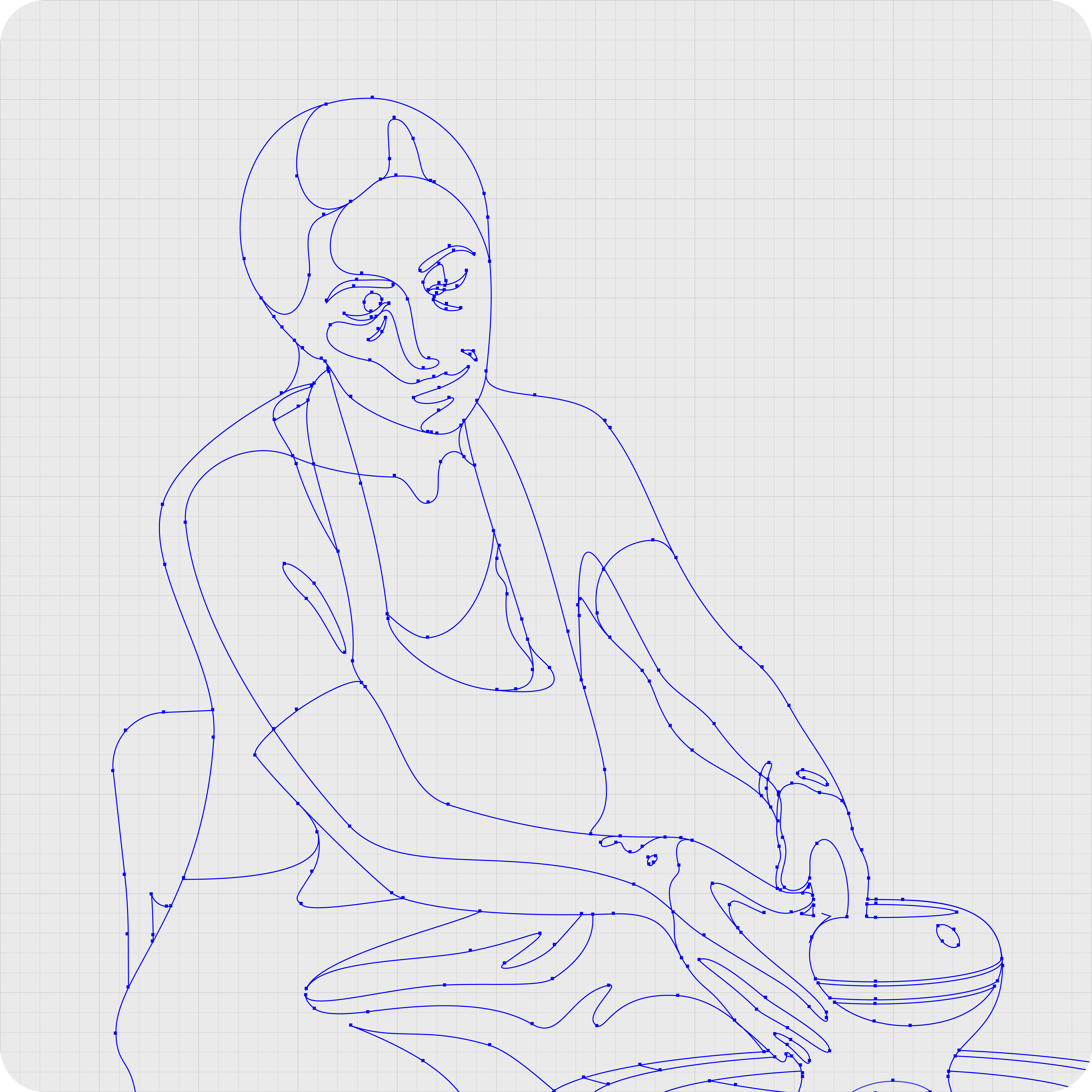
Moneyfarm’s visual identity was reimagined through a new illustration style that enhanced usability, conveyed clarity, and reflected the brand’s calm professionalism by embodying its human-centric ethos.
Role
As the in-house illustrator for Moneyfarm, I was tasked with creating a fresh illustration style to replace old, overused visuals that no longer aligned with the brand. I collaborated closely with the head of design to ensure the new illustrations embodied the brand’s values and were adaptable across multiple platforms.
Tools
Adobe Illustrator
Adobe Photoshop
Adobe Dimension
Cinema4D
Figma
Date
08/2021 – 12/2023
Tools
Adobe Illustrator
Adobe Photoshop
Adobe Dimension
Cinema4D
Figma
Date
08/2021 – 12/2023
Drawing inspiration
Evaluating the existing aesthetic
First, I evaluated the old illustrations. They felt detached and poorly executed, inconsistent with the brand’s vision of professionalism and approachability.
Analysing past references
Second, I examined the work of Malika Favre, which had inspired the original illustrations. Her bold vector style skewed towards a fashion-focused audience, misaligned with Moneyfarm’s traditional demographic.
Capturing the right mood
Lastly, I turned to lifestyle photography depicting the lives Moneyfarm’s clients aspired to. They provided tonal references, emphasising optimism, warmth, and tranquility.
Constructing a functional and emotive style
Constructing a functional and emotive style


Merging structure with fluidity
The head of design emphasised the importance of combining polished detail to reflect the brand’s professionalism with a free-flowing quality to evoke the effortless ease of using the service.
Building with multiple sources
Reference materials included photography, digital collages and 3D models. Utilising Adobe illustrator, each shape was traced to capture shadows, highlights, and mid-tones.
Driving sign-ups using narratives
Incorporating storytelling into the illustrations on Moneyfarm’s website helped describe their product offerings, increasing the possibility of sign ups.
Tailoring illustrations to platform needs
High Fidelity
Highly detailed illustrations, primarily used for storytelling on the website, social media, and TV campaigns.
Mid fidelity
Moderately detailed visuals, designed for larger app features. These struck a balance between simplicity and visual richness.
Low fidelity
Minimalist designs with bold shapes, optimised for app icons and identifiers. They ensured clarity at reduced sizes.
High fidelity
Highly detailed illustrations, primarily used for storytelling on the website, social media, and TV campaigns.
Mid fidelity
Moderately detailed visuals, designed for larger app features. These struck a balance between simplicity and visual richness.
Low fidelity
Minimalist designs with bold shapes, optimised for app icons and identifiers. They ensured clarity at reduced sizes.
Adjusting for accessibility and comfort
I reworked the illustrations to suit the app’s dark mode interface. Shadows and highlights were modified so the designs would feel native in the muted environment and maintain their visual comfort.
Over the course of two years, I created 195 illustrations, each crafted with precision and intention. This project exemplifies my ability to develop cohesive visual systems and solve complex story telling challenges. Having illustrations as a defining brand element offered Moneyfarm a flexibility that allowed them to visually communicate their message across platforms in a way that felt unique and tailored.

