Mondi Paralleli
Mondi Paralleli was a series of geopolitical insights conducted by political analyst Dario Fabbri exclusively for Moneyfarm across two public live events, written articles and essays. Fabbri offered an in-depth analysis of macro trends that are defining the international relationship between power, society and economics.
Role
My responsibility as the in-house Graphic Designer was to develop a unique visual identity, distinct from Moneyfarm’s existing campaigns, with a focus on its social media roll-out. In addition, I provided the design team with creative guidance, ensuring that all visual elements aligned with the established campaign identity.
Tools
Adobe Illustrator
Adobe Photoshop
Adobe After Effects
Figma
Date
05/2023 – 12/2023
Tools
Adobe Illustrator
Adobe Photoshop
Adobe After Effects
Figma
Date
05/2023 – 12/2023
Using relevant references
Customer Survey
To build the campaign’s identity effectively, I had to identify Moneyfarm’s target audience, for which I used a customer survey conducted by a leading creative agency. The latter pinpointed the defining factors of Moneyfarm’s audience, including its target audience persona: the ‘Confident Delegator’.
The Persona
This audience is primarily composed of 48-year-old married men with teenage children, with a €100K+ median income and €350K+ invested capital. Often introduced to Moneyfarm by a friend, this demographic profile highlights a financially stable individual seeking reliable investment opportunities to secure his family’s future.
Data Analysis
Media consumption in Italy skews towards traditional formats such as printed business magazines (36%), national online newspapers (35%), and live TV broadcasts (29%). Streaming services (39%) top the survey, indicating an appetite for long-form digital content. The continued popularity of traditional platforms highlighted the need to draw visual inspiration from these sources.
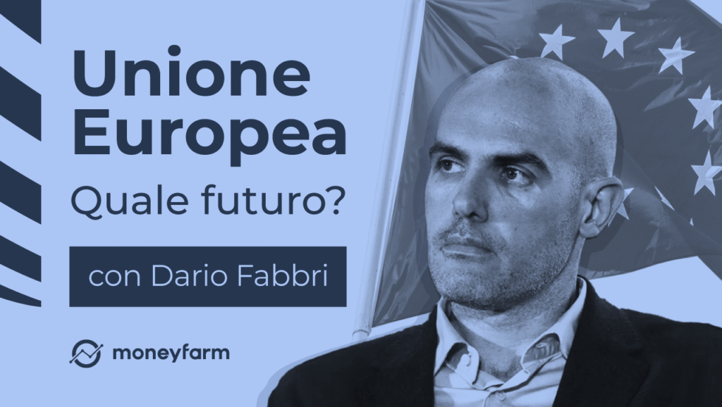
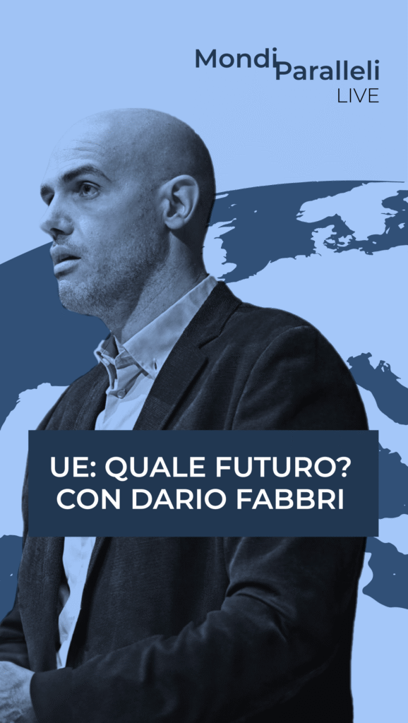
Dario Fabbri
Dario Fabbri is a renowned Italian geo-political analyst and co-editor of the geo-political magazine Domino. He regularly appears on national TV shows that cater to audiences interested in political analysis. It was essential for us to build the campaign's brand drawing upon the programs in which Fabbri features in the hope of fostering relatability and engagement.
Will Italia Podcasts
Amongst the references were the covers of podcast series published by Will Media, a prominent Italian media company specialising in news about politics and current affairs distributed exclusively through its social media platforms.
TV news graphics
Amongst the references were the covers of podcast series published by Will Media, a prominent Italian media company specialising in news about politics and current affairs distributed exclusively through its social media platforms.
Dario Fabbri
Dario Fabbri is a renowned Italian geo-political analyst and co-editor of the geo-political magazine Domino. He regularly appears on national TV shows that cater to audiences interested in political analysis. It was essential for us to build the campaign's brand drawing upon the programs in which Fabbri features in the hope of fostering relatability and engagement.
Will Italia Podcasts
Amongst the references were the covers of podcast series published by Will Media, a prominent Italian media company specialising in news about politics and current affairs distributed exclusively through its social media platforms.
TV news graphics
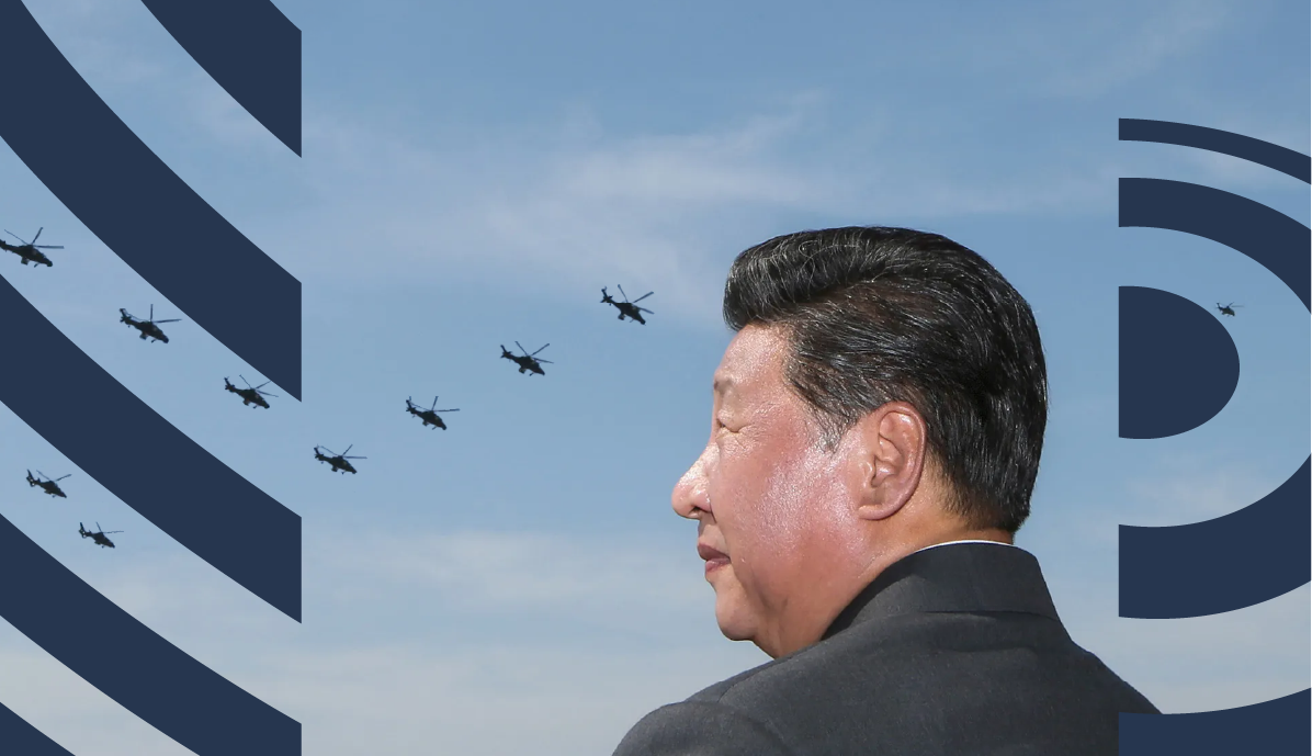
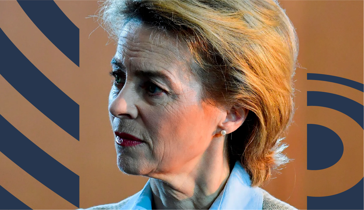
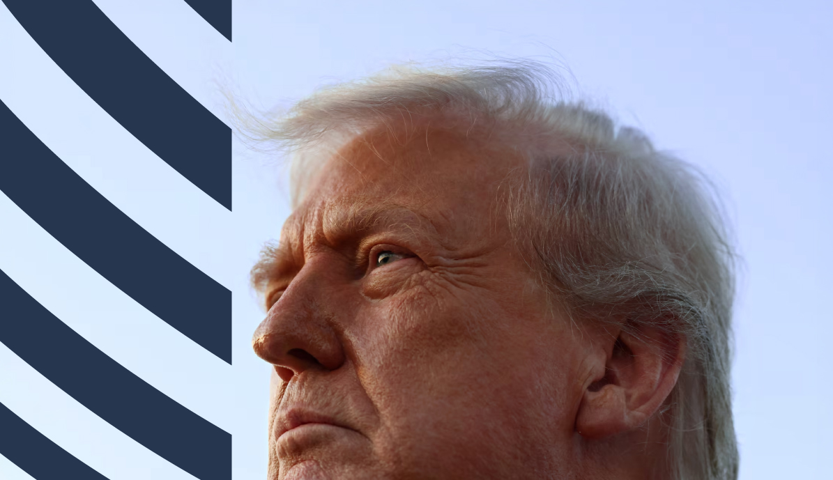
Moneyfarm’s aim for the campaign was to communicate authority and trustworthiness, which is why we looked to TV news graphics as a source of inspiration. The inclusion of data and spinning globes suggests that the news program is backed by facts and credible sources, reinforcing its reliability in delivering accurate information.
Conveying meaning through brand
Determining the concept
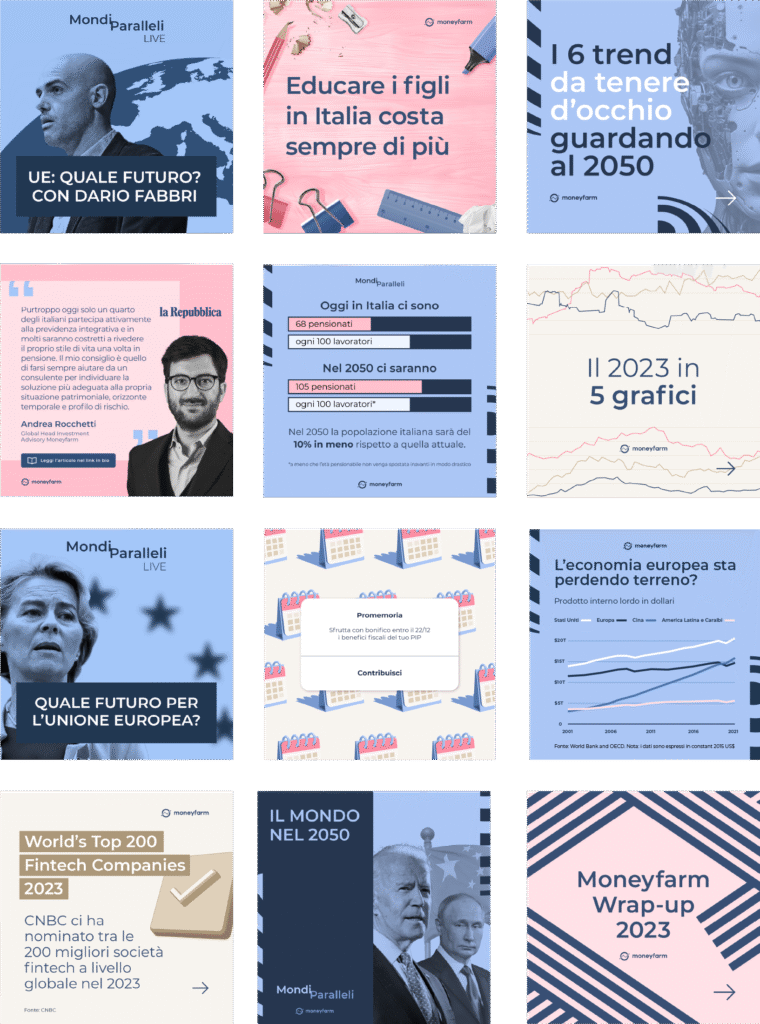
To visually capture the notion of a world shaped by intersecting trends and multiple realities, I fused rotating globes on different axes. This sense of parallel movement was also enhanced by connecting the words “Mondi Paralleli.” My intention for the key visual was for it to serve a dual function for both static and animated assets.
Defining the identity through colour
The dark blue establishes a serious tone while the light blue adds a sense of stability and openness. This blend embodies the harmony between Fabbri’s informed insights and Moneyfarm’s stress-free wealth management. Another rationale behind utilising these colours was their absence in any previous Moneyfarm campaign, setting it apart from the rest.
Evoking the desired emotional response
With its evocative composition, the campaign theme tune conveys the gravity of geopolitics whilst capturing the dynamism of the modern media landscape. There are shifts in tempo and intensity that reflects the ebb and flow of news events. The music builds to a climactic crescendo, heightening the sense of anticipation before the video ends.
Assessing the campaign's performance
View increase of
first live event video
When compared to the average of all Moneyfarm’s YouTube videos, the views for the first live event had an increase of +3750%. The impressions for the second live event reached a total of 3.9 million. This is the highest level of impressions ever reached on its channel.
The reel that followed the first live event is the second-most replayed reel on Moneyfarm’s Instagram with +4.7K plays. The chart informed by one of Fabbri’s articles is its third best-performing Instagram post with +5.6K impressions.
Second-most replayed reel on Moneyfarm’s Instagram
Looking at the success of the campaign’s performance, it feels great to have boosted Moneyfarm’s brand. Above all, I sensed that a real exchange of value took place between the content provider and the consumer. As a designer, it feels satisfying to have created something that respectfully conveys the information to consumers by representing finance in a way that restored its sense of seriousness and focus.
Next is
Content Creation Framework